3/28/09

There is a bug comimg to my house...

... a Schacht LadyBug, that is. It was ordered a little while ago, and as I type, it is on its way here. The last update was a departure scan from UPS in New Stanton, PA.


At risk of sounding Unprofessional here, WOOT!


Ok. So why should that be so exciting, you ask? I mean, after all, I do have a spinning wheel i love already... it does make yarn...


But The Ladybug has several features that appeal to my ever questing self. First and formost, Speed! My current beloved wheel has a high Ratio of 13:1. That is, for every 1 time the big wheel turns, the bobbin turns 13 times. (for my irish tensioned, bobbin led wheel) The Ladybug, with the High Speed whorl that is packed inside the box (an add on, not a standard item) has a high ratio of 22:1. What does that mean? It means that I can spin almost twice as fast at the high ratio in long draw, or create much much finer yarns in general.


Another reason I am excited, well, its the Learning, of course. My current wheel is an Irish Tensioned wheel, or Bobbin led. I love it. but there are 2 other types of tensioning (that I know of). The Ladybug has both, Scotch tension, and Double Drive. After reading on various forums and ravelry groups all about both types of tensioning, I have been dying to try them for myself. From what I read, I have a feeling I may enjoy double drive best... but I will hold off on judging till after I try it.


I am also looking forward to the larger treadles, and the fact that this is a double treadle (the foot peddles, yo). My current wheel is a single treadle wheel, and sometimes I feel like I need to hold down the wheel as I treadle like mad to reach speed. with a double treadle wheel, I should have a better balance, less effort required to keep the wheel turning, and more speed. and treadle size? well... I have size 10 feet. I didn't think so at first, but if I spin for a few hours on my wheel, my heel starts to feel bruised. the Ladybug, I am told by another Large-footed friend, resolves that issue completely.


And then there is the noise. My current wheel, though I love it dearly, makes a fair amount of noise. I don't usually mind it (though my poor husband does), but when I want to spin, and my poor Beeba 2 wants to sleep, we have a sore conflict of interests. As the responsible mom, I have relegated my spinning time to when she is not sleeping... which leaves only when her daddy will hold her for me to spin... not much time.


The Ladybug, as I understand it, is nearly silent. I can spin with a sleeping baby on my lap if I choose. Ah, the novelty!


So, it will be here sometime Monday, and you can be sure there will be assembly pics, and spinning pics, promptly on Tuesday. Becasue as we all know, I am just a little bit addicted to blogging. And I can't bear to miss a phot opportunity... maybe, if the wheel comes during naptime, I'll assemble out on the porch... then I'd get some really nice pictures.


For now, a Stock photo will have to do:

Ladybug Spinning Wheel
Th-Th-That's all Folks!

Photobucket

3/27/09

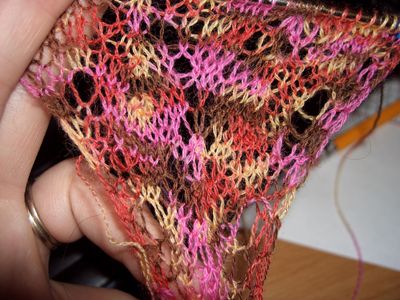
Lace! and a matching set.

I'm making it, yes I am... wanna see?


Lace

Lace

Isn't it pretty?


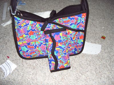
And here is the matched set, my new purse with the matching Wallet:

matching set handmade

Please ignore the scrappy mess on my floor. It gets that way when I am crafting... I just throw things over the side of the desk as I work... I really need a new trash can for that space...


Photobucket

3/26/09

Daily Changes...

... And I'm not done. I'm still not happy with the nav Bar, still trying to tweak that into submission... But I like the links I've got in it.


And I am playing with my banner. I got rid of the Pixelized image that was on it, and replaced it with a different copy of the same image... only... then, the image looked weird, with grass as the main part of the image. So I changed that, cut out the grass, and re-centered the text. Then the Picture looked too small next to a wide expanse of green.


Don't get me wrong, I love the green. But just not quite so much of it. So I changed it yet again, this time adding a second copy of the picture on the other side.


You know what I realized? I need to take new pictures. I love the format of the header now, a pic on each side... But I think it looks strange having the SAME pic on each side. Plus, now I have 2 beeba's, which I didn't have when I first started the Beeba Bottoms business and the blog.


My new thought is: I need new pics of both the kids. Only... Beeba 1 is getting a little big to photograph in nothing but a diaper... especially since, he doesn't actually wear diapers anymore... he wears training pants now.


So, what pics can I use that illustrates the title of the Blog, keeps in mind my business header (which I really should give an update to as well), and still protects the kids anonymity? because really... they are not going to want people being able to pick their diaper images out in a line-up...


Do I go with 1 picture again, but switch to a new pic of Beeba 2's Behind? what about a rendered drawing? artwork rather than photography? Which reminds me that I still need a logo for Crystal City Fibers, as well.


what about 2 photos, keeping the original as is, and Adding Beeeba 2's photo?


One thing is for sure... I can't do any new photos till it is warmer here... as in, the summer. because if I try to take a backyard photo in just a diaper right now, I'll have to call and report myself! Its way too cold. I won't even let the kids go near the open door in shorts most days... long pants ans good socks are a must. and sweaters.


but indoor photos never look as nice.


Oh, another point is I don't want to change the colors of my header... much rather change the colors of the blog, but it won't let me... stupid template. and if I change the template, I lose all the tweaking I've done. Waah!


Ok, so I have some work cut out for me. I don't think I realized how much till I wrote this post.


And maybe its a good thing that I've been recording my sources for the widgets I like... I may wind up needing to re-do them.


Photobucket

3/25/09

What I'm working on...

Kind of. Alright, so its one thing I AM working on, and one thing I just finished.


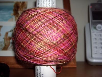
So, what I am working on, aside from my socks, and a million other projects, this is my newest project:

Lace Yarn

Yes, Its just yarn atm. I cast on, but with a 3 stitch cast on, it doesn't look like much. this is the yarn for my Blue Jeans Lace Leaf Shawl. it is very fine, and I think maybe I am crazy, xause even for lace, this is LACE. it is as fine as my very finest handspun, only I can't seem tom make handspun in this qualntity in this fineness... I get bored way too fast. hence buying the yarn this time. Plus it was on sale.

And the project I finished, My Jenny Bag. I love this pattern. and best yet, the designer is a friend from one of my message boards. Can't beat supporting your friends and getting something cool too.

Jenny Bag

Ok, so the fabric is very bright. But it matches my Mei Tei, and I really love it right now. I know, I'll probably get tired of the print eventually, but that's the great thing about making things... you can always make another! I also made a matching wallet, from another of the same designer's patterns, and am debating making the sunglass case that comes with this pattern. I have the leftover fabric, and I might. I also added ties to the purse so that I can close it. it is reversable, by the way, so if I want somethign a little less loud, I can also have a plain black purse at the spur of the moment. cool, huh?


Photobucket

3/24/09

Trying something new...

and I am gonna rely on my readers to decide whether to keep it or not.

Notice the top of the blog? Under the header. Thats right... its a new nav bar. I can't quite get it just right, I think... and I am debating... Do I like this better than the big old "about me" blurb on the side?

I truly don't know.

On the one hand, I can have my "about me" section much more expanded in a separate page without interrupting the flow of the blog... on the other hand, the Nav bar itself is not the greatest.

I can keep trying to adjust it... I had basic buttons up there, but I hated how they did not mesh with the blog... and I am not a graphics person. Buttons would look better, if the buttons looked good. I really would like buttons.

But, I don't know how to do good ones.

So. do I keep the nav bar, or lose it and bring back the old "about me" blurb on the side? Its up to you, readers. I can't seem to decide on my own.

Photobucket

3/23/09

Widgets that work, and That don't work...

In the last few weeks, I have installed some new widgets to my site here. And I have uninstalled some.

You might notice the Label Cloud. That is a very cool widget, I found instructions for at www.techknowl.com.

You may also have noticed the Related Posts Links, which are now removed. Somehow, they worked well at first, but later started saying "please upgrade". Since they were less than pleasing, I won't tell you where I found them. I'll keep looking for a better solution.

Or the fact that my Blogger Nav bar is gone, giving the blog a more streamlined and (hopefully) more professional look. That was a tip I found at another TechKnowl post.

I also was able to add true Meta Tags to the code of the Blog. Yet another TecKnowl post.

Notice a theme? I like TechKnowl, lol.

But really, I keep hearing people talk about how they like Wordpress better. Why?? I can get everything they have right here, and not confuse my readers by changing over to a different URL.

Hey, if Wordpress has it, and I want it, I bet I can find it. What do you think?

And, if I find more cool widgets, I'll share them with you. Its only fair, after all. If I am gonna do the research to find these things, whether I use them or not, I may as well share that info with my loverly readers!

Till later, Signing out.


Photobucket

3/22/09

She Walked!

Beeba 2, that is. Not far, mind you, but she did. She took 2 steps all by herself yesterday. Aren't you proud of her?

Mow back to your regular scheduled programming.

Photobucket
 

blogger templates | Make Money Online